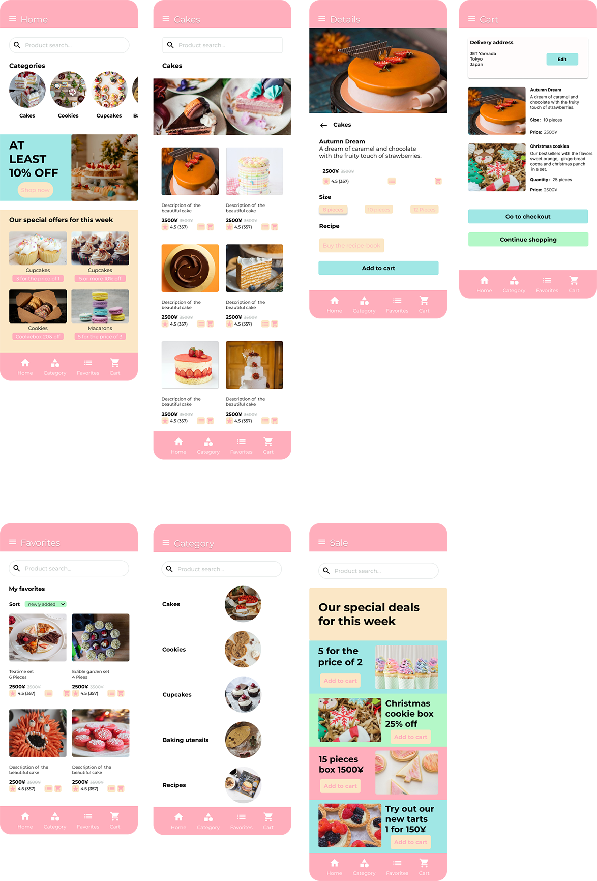
In my cakeshop design, I was inspired by a pastel color palette. The homepage is designed to be as attractive and clear as possible. Therefore, I decided to place the categories at the top, accessible through horizontal scrolling. Below that, there is a category for discounted products and a special category that changes weekly. Since this design is for a cake shop app, it aims to encourage users to visit the app regularly to discover the weekly offers. The main part of the pages is kept in white and is complemented by pastel accents, giving the design a soft and playful touch. This is intended not only to ensure functionality but also to invite users to browse.
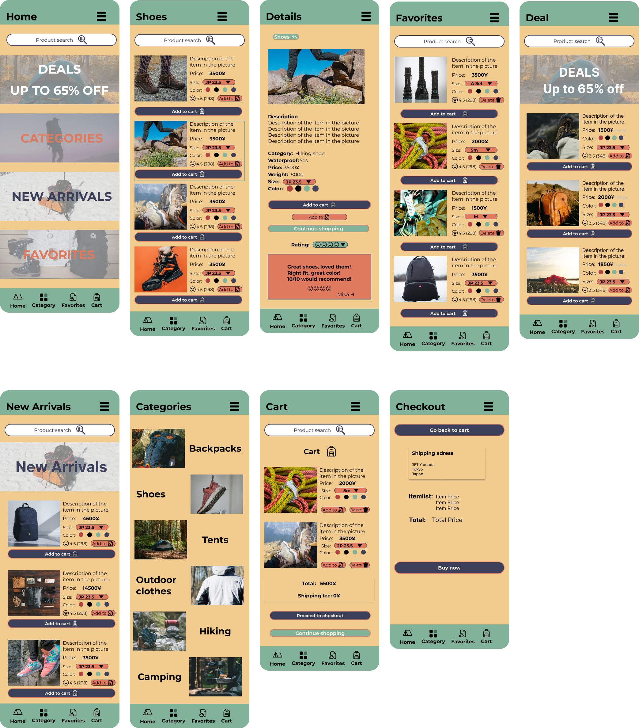
My design for the outdoor shop is intended to be primarily functional. The chosen colors are deliberately muted and less playful to ensure clear contrasts, allowing important details to be highlighted effectively—an essential aspect for a page offering outdoor equipment. People want to go out, hike, climb, and camp, so it was crucial to design the detail page to provide all key information at a glance. Additionally, users can view and filter reviews by good, bad, or average ratings at the bottom of the page. Another focus was to add some originality to the bottom navigation bar, considering it is an outdoor shop. This is always a challenge, as the symbols need to be easy to understand and familiar, yet also give the site a unique character. Therefore, I chose a tent icon for "Home" and a backpack icon for "Cart". All pages have a consistent layout to make navigation as straightforward as possible.